Creating and Saving Time Series Graphs of the number of tweets collected
A time series of how often the tweets in the collection occurred for each hour selected can show patterns of changes in interest over time. To create such a graph a different window is needed than the main search interface.
- Download and install Mozdeh, if you have not already done this.
- Collect tweets for your project if you have not already done this. The tweets can be from keyword searches or from a set of users.
- Select Graph Time Series from Mozdeh's Analyse menu.
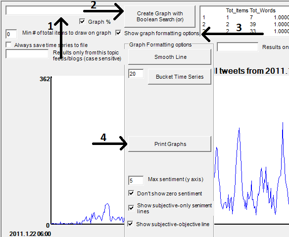
Now follow the instructions below to create a graph of the overall volume of tweets in your project. See the image for the buttons to click.
- Click on the box in the top left hand corner (1) and clear the text so that it is blank.
- Click Create Graph with Boolean Search (2). This will show the total number of tweets collected over time.
- If you want to print the graph, click Show Graph Formatting Options (3) and then...
- Click Print Graph (4). Before printing, select the printer options in the print dialog box and change the paper layout to Landscape or some of the graph will be missing.
- To return to the main search screen, select Search from the Analyse menu.

Creating and saving a time series of tweets in the collection that match a query
A time series of how often the tweets in the collection match a particular query can show patterns of changes in interest related to that query (e.g., riot) over time. To create such a graph, the above instructions need to be slightly modified.
Now follow the instructions below to create a graph of the overall volume of tweets in your project. See the image for the buttons to click.
- Click on the box in the top left hand corner (1) and enter your query in the box.
- Click Create Graph with Boolean Search (2). This will show the proportion of tweets collected that match your query.
- If you want to print the graph, click Show Graph Formatting Options (3) and then...
- Click Print Graph (4). Before printing, select the printer options in the print dialog box and change the paper layout to Landscape or some of the graph will be missing.
To return to the main search screen, select Search from the Analyse menu.
Sentiment graphs
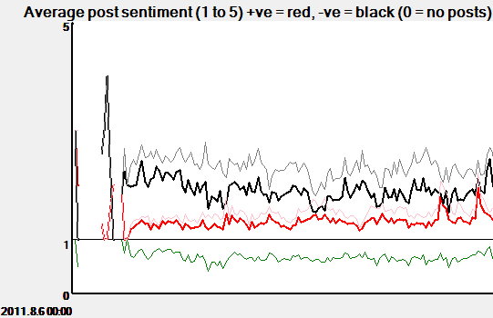
The above methods also create sentiment graphs underneath the main graphs, as illustrated below.

Sentiment graphs include the following components:
- A thin black line illustrating the average negative sentiment strength of the tweets in the main graph. The scale used is from 1 (no negative sentiment) to 5 (very strong negative sentiment).
- A thin red line illustrating the average positive sentiment strength of the tweets in the main graph. The scale used is from 1 (no positive sentiment) to 5 (very strong positive sentiment).
- A thick black line illustrating the average negative sentiment strength of the subjective tweets in the main graph. A tweet is classed as subjective if it contains either negative or positive sentiment.
- A thick red line illustrating the average positive sentiment strength of the subjective tweets in the main graph.
- A green line illustrating the proportion of tweets in the main graph that are subjective.


